Work — Type — 2022
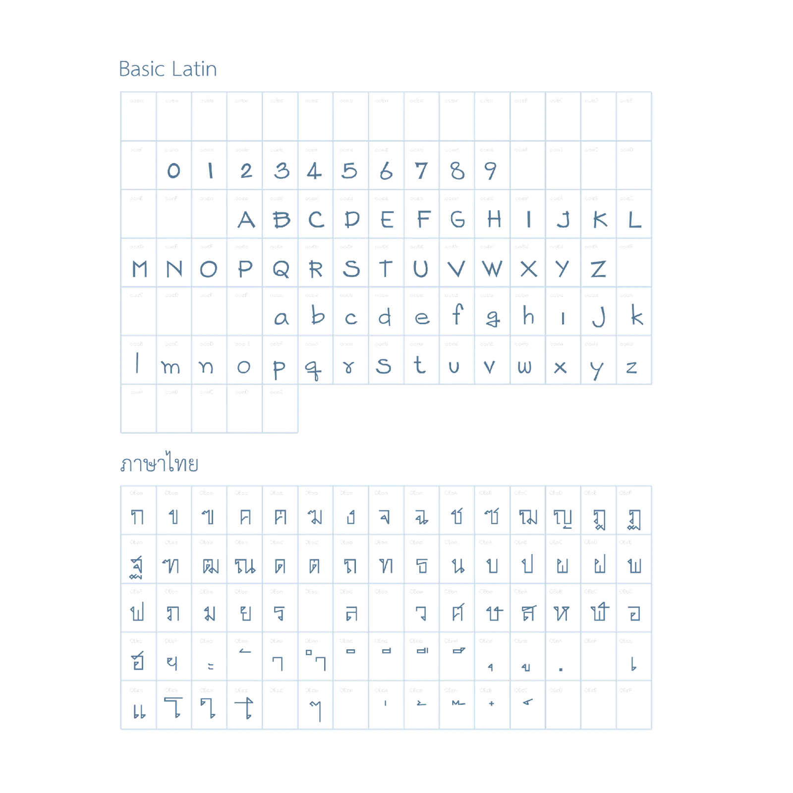
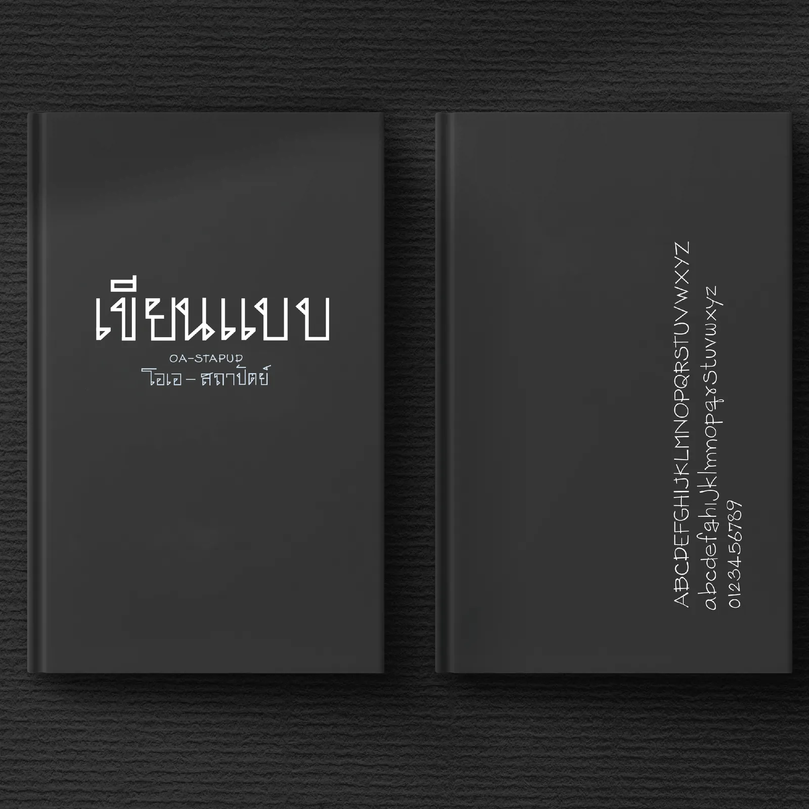
OA-Satapud — Thai/Latin Typeface
แบบตัวพิมพ์ OA-สถาปัด
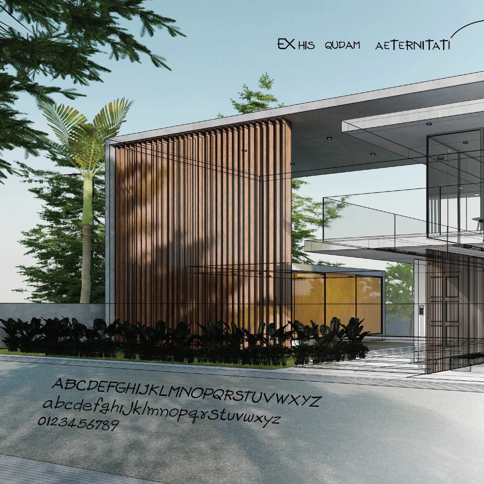
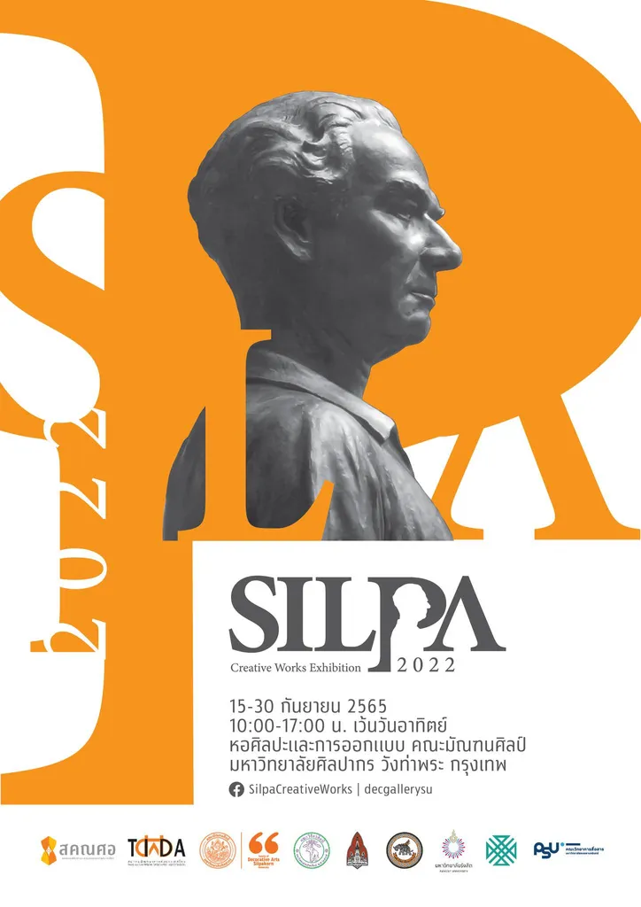
A Thai and Latin typeface drawn from the hand-lettering conventions of Thai architectural drawing. Winner, Creative Design Award (CDA) 2022; exhibited at Chiang Mai Design Week 2022 and SILPA Creative Works Exhibition.
-
Award — 2022
Creative Design Award (CDA) — New Media Design
Creative Chiang Mai
For the typeface OA-Satapud
Where the letters come from
Thai architectural drawing has its own lettering tradition — a disciplined, slightly compressed hand taught in drafting rooms and passed between generations of students who never think of it as type. It is one of the few Thai letterforms with a genuinely technical origin.
OA-Satapud takes that hand as its source and asks what it becomes when it is made systematic: consistent stroke weight, resolved joints, a stable rhythm across a full character set, and a Latin companion drawn to the same logic rather than borrowed from elsewhere.
Thai and Latin as one drawing problem
The hard part of a bilingual typeface is not covering both scripts; it is making them agree. Thai carries loops, ascending and descending marks, and a much denser vertical stack than Latin does. Matching them by height alone produces a Latin that looks starved next to its Thai.
The translation here was made at the level of stroke logic rather than metrics: both scripts are drawn from the same instrument at the same speed, and the proportions follow from that shared constraint.
What the award changed
The prize and the two exhibitions matter here less as credentials than as the moment the typeface stopped being a private drawing exercise. Once it is on a gallery wall and in other people’s files, it has to hold at sizes the drawing never anticipated, beside words it was not tested on, in the hands of someone who will not ask the designer what was intended.
Everything after that — the spacing passes, the second Latin weight, the decisions carried forward into OA-Reloyd — came out of watching it be used rather than out of drawing it further.