Teerasak Sakon

ผศ.ดร.ธีรศักดิ์ สะกล — Thammasat University, Lampang

Work — Identity — 2026

Never a Pause — FATU 25th Anniversary

ไม่หยุดก้าว — ตราครบรอบ 25 ปี คณะศิลปกรรมศาสตร์

A twenty-fifth anniversary mark that refuses to look backward — one unbroken diagonal, resting on a flat foot, its far end left open and short of the frame. Delivered as a working system: measured construction, a bilingual manual, an element kit, and press-ready artwork.

Client
Faculty of Fine and Applied Arts, Thammasat University
Role
Designer — concept, mark, system, manual, print artwork
Year
2026
Never a Pause — FATU 25th Anniversary

The argument

Twenty-five years is usually an excuse for a laurel wreath. The faculty’s own account of those years is less comfortable than that: some stretches were fast, others had to be worked through, but the direction never reversed.

So the mark was built to point forward rather than to celebrate what is finished.

Where the idea lives in the form

The concept is not written beside the mark; it is built into it.

The diagonal is one stroke drawn in a single movement — no joints, no hesitation along its length. It rests on a flat, firm foot. Its other end stays rounded and open, stopping short of the frame rather than colliding with it: a way of saying that this is not the end of the line.

Every one of those decisions is written down in the manual against the measured value that carries it, so that anyone who inherits the mark can reproduce not just its shape but its reasoning.

Measured, not described

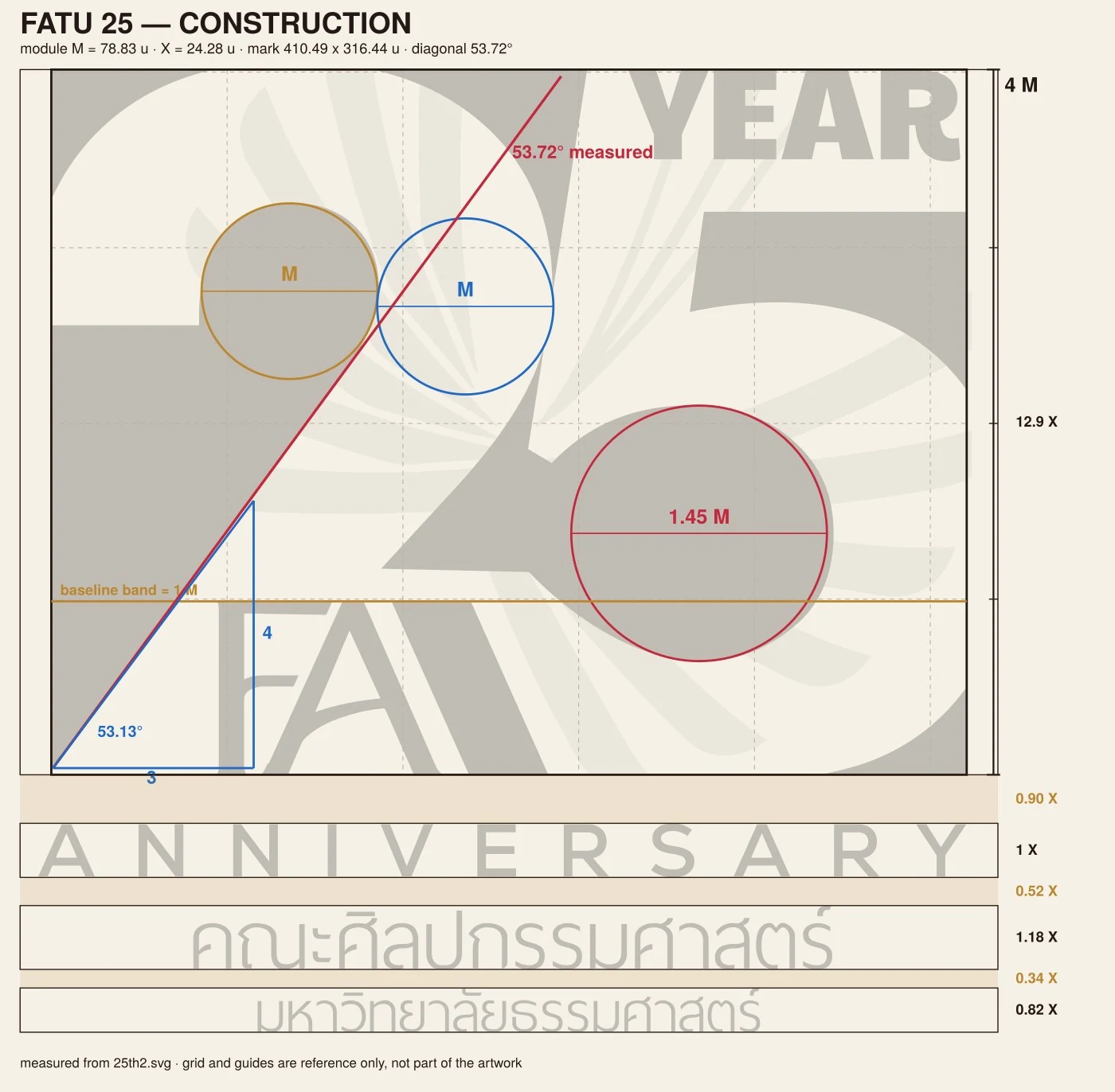
The second stage went back to the master drawing and measured it. The module M is the head of the numeral 2 — the same width as the counter beside it. The mark stands four modules tall; the cap height of ANNIVERSARY is a sixth of that; the diagonal runs at 53.72°, a slope of three to four. Four of those relations sit within one percent of the golden section, which is worth saying plainly rather than overselling: the form was drawn by eye and then found to be close, not generated from a formula.

Those figures are what the rest of the system is built on. Clear space is half a module. The minimum lockup is 45 mm, the mark alone 25 mm. The stroke weights in the element kit are the three weights already present in the mark. Nothing in the kit is a new invention placed next to the logo.

A manual people can actually use

The guidelines are issued three ways from a single source — a web page, a print PDF, and a Word file the faculty can edit — so that nobody has to ask a designer for a copy they can work with. Fourteen sections, Thai and English side by side, sixteen figures, each figure showing a rule rather than decorating it. Six cases show what correct use looks like; six more show what is forbidden, with the reason attached.

Artwork, not mockups

The stationery is vector artwork drawn at true millimetre size with a 3 mm bleed and crop marks on every corner: a business card front and back, an A4 letterhead, a DL envelope, a compliment slip. The gold sits at 26 mm on the card and 46 mm on the letterhead because those are the values the module gives, and the files carry their placeholders in guillemets so the faculty fills in names and addresses without moving anything else.

The whole set is reproducible from the master file and transferable to whoever holds the identity next — which is the only test a commemorative mark with a one-year life can usefully be held to.

The applications that close this page are visualisations, built from the same master mark to show the system at the scales the element kit was drawn for — from a 45 mm embroidery to a wall.
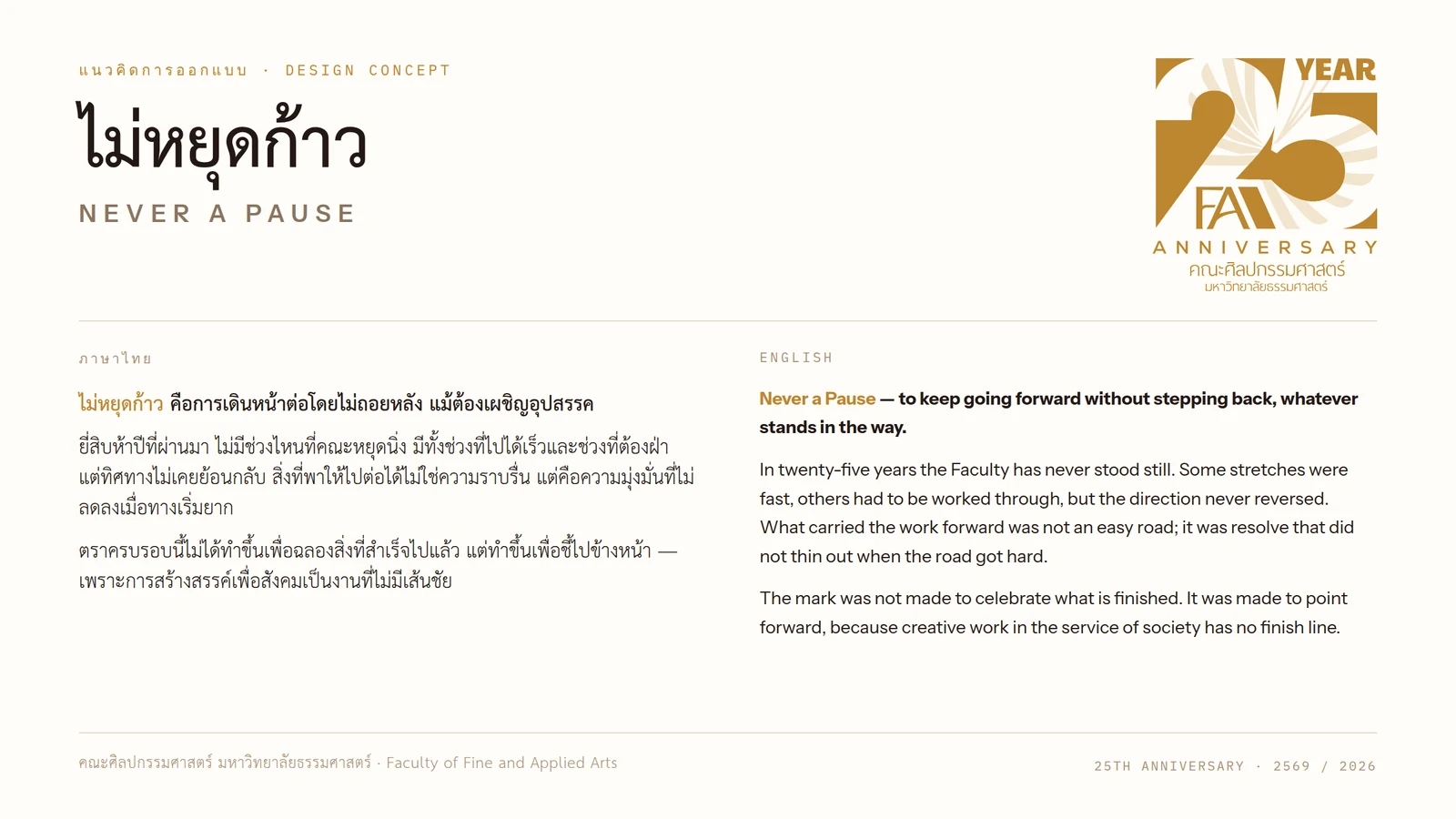
The bilingual concept statement — the Thai and the English set side by side, the mark at the head of its own argument.
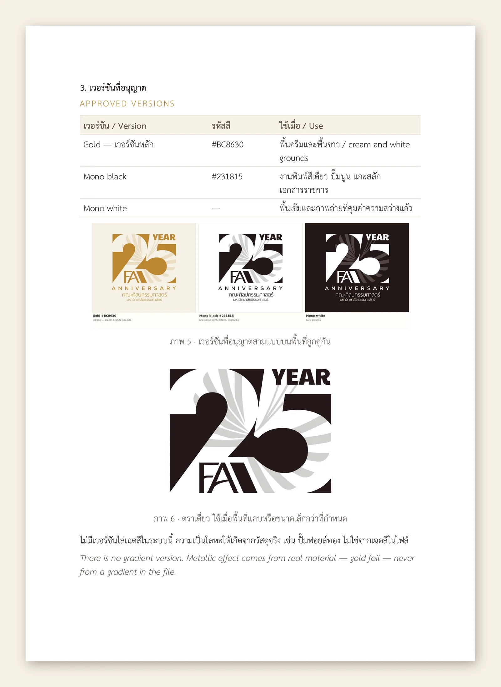
Manual, section 3 — the three approved cuts, each tied to the ground it is allowed on, and the solo mark for sizes below 45 mm. There is no gradient version: the metallic comes from foil, never from the file.
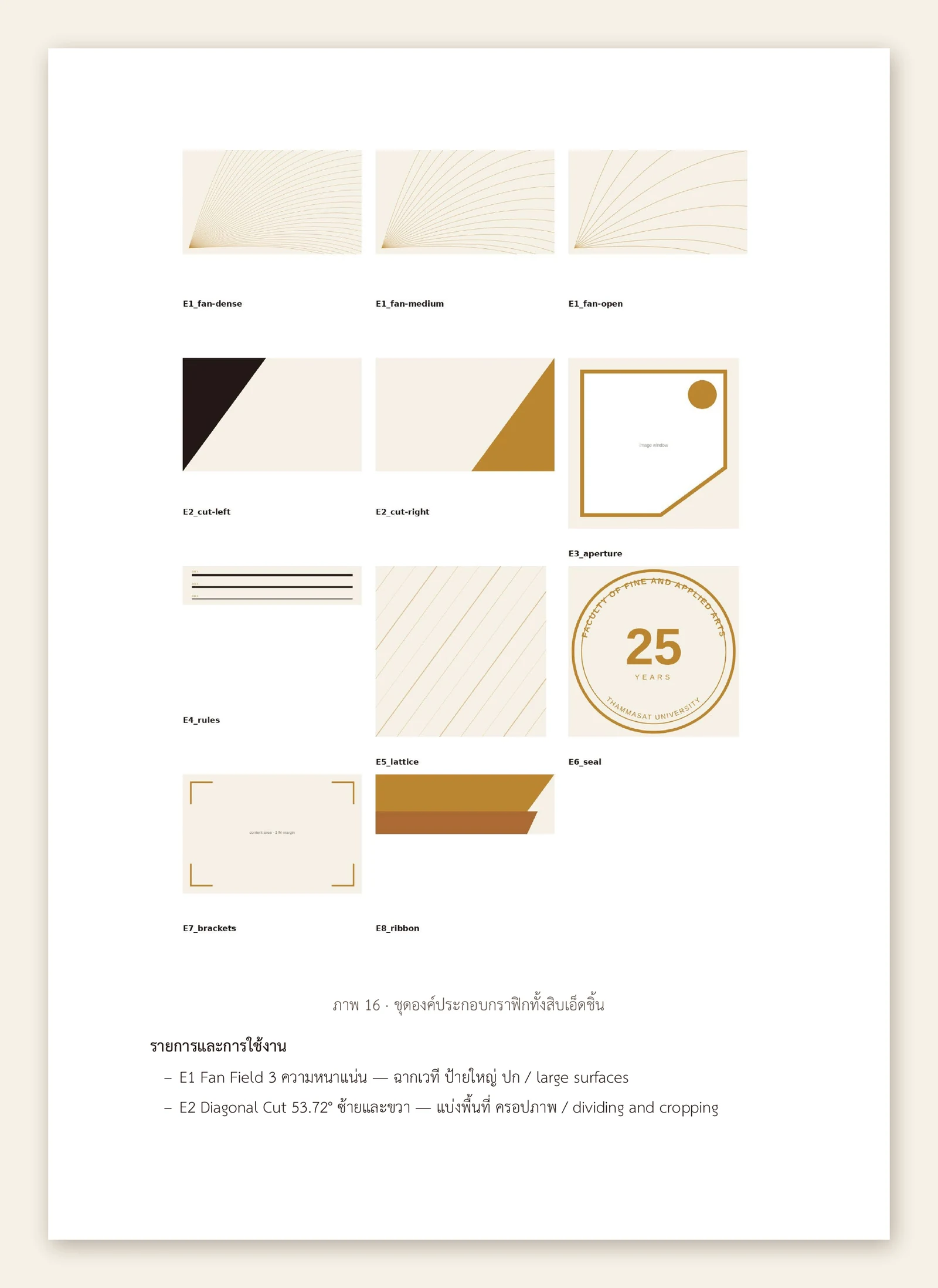
Manual, section 8 — the element kit as the faculty receives it: eleven named files, each one measured out of the mark, with the rule for using them printed underneath.
Drag to take the mark off its own measuring sheet. The module M is the head of the numeral 2, the mark stands four modules tall, the diagonal runs at 53.72° — every figure read off the master file rather than drawn to illustrate it. Both frames are cut from the same file, so they register exactly. Mark Construction
Drag to take the mark off its own measuring sheet. The module M is the head of the numeral 2, the mark stands four modules tall, the diagonal runs at 53.72° — every figure read off the master file rather than drawn to illustrate it. Both frames are cut from the same file, so they register exactly.
Mono cut — the form holding without colour to carry it.
The diagonal uncovered along its own 53.72° slope — four seconds, mono white on ink, no gradient anywhere in it. Cut from the master file rather than animated by hand.
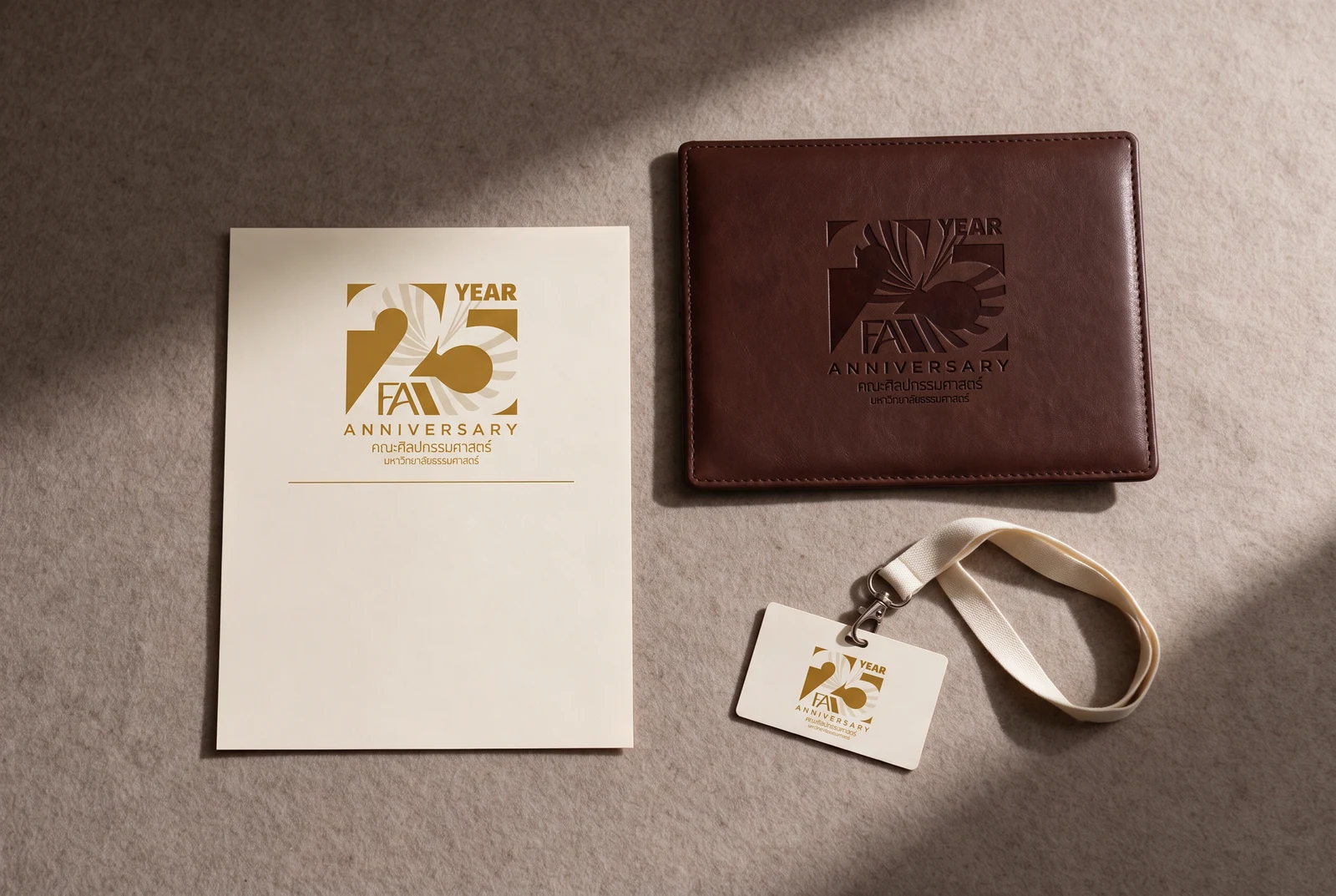
Certificate, leather portfolio and name badge — the same lockup foiled on three grounds, each at the size its piece allows.
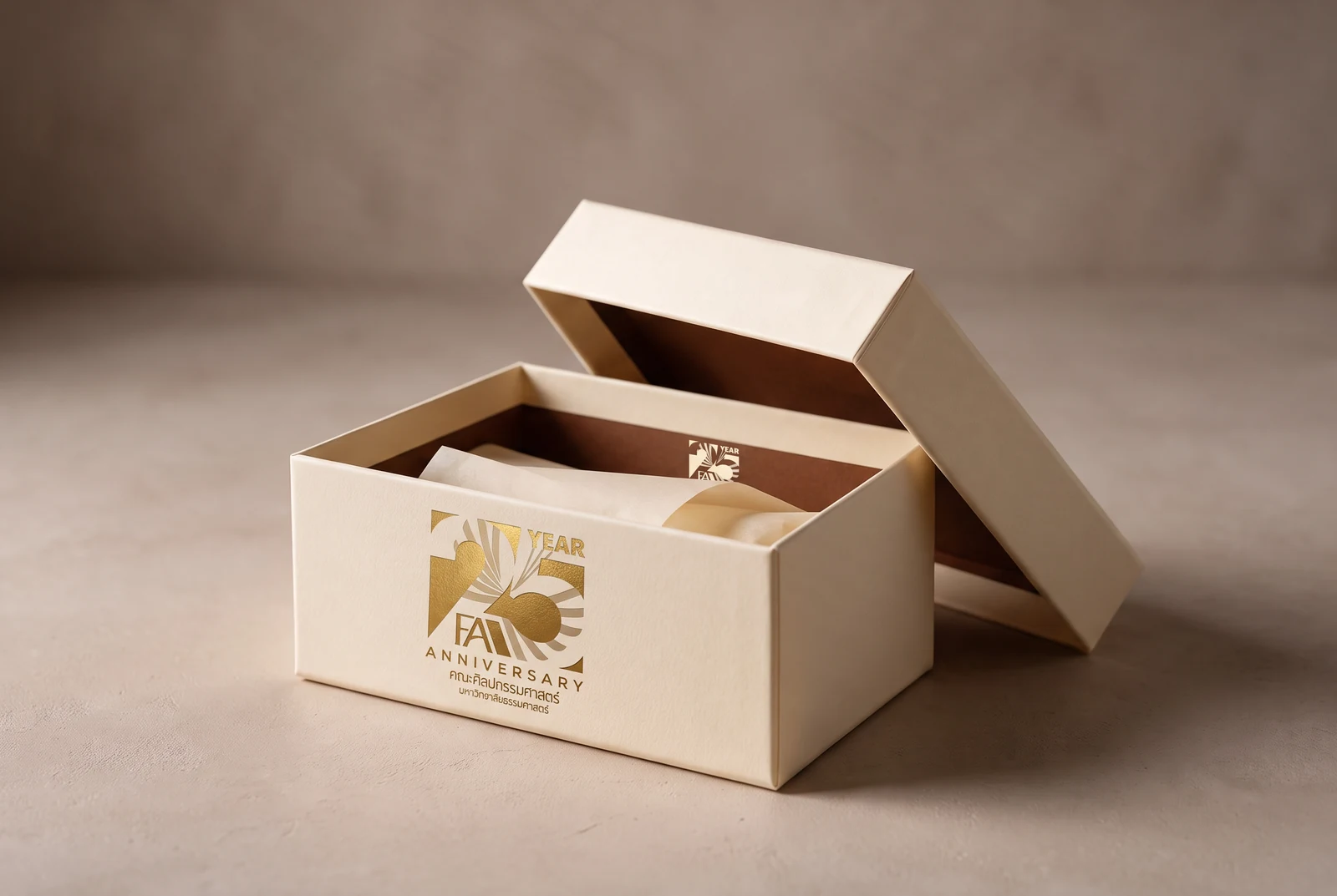
Gift box — the mark foiled on the lid, the counter of the 5 repeated inside as a closure seal.
Paper carrier — the mark at the top of the panel, the fan field held to the lower third so the bag still reads when it is full.
Cotton tote — mono black on natural canvas, the cut the manual specifies for one-colour printing on cloth.
Staff sweatshirt — the full lockup at chest size on cream fleece, about the smallest the whole lockup is allowed to run.
Tumbler and cotton pouch — gold on cream, mono black on natural, the two cuts doing the work the grounds ask for.
Brushed-brass plaque — the one place the metallic is real rather than drawn, which is the rule the manual sets for it.
Roll-up banner — the mark on ink at full height, the fan field opened across the foot of the panel.
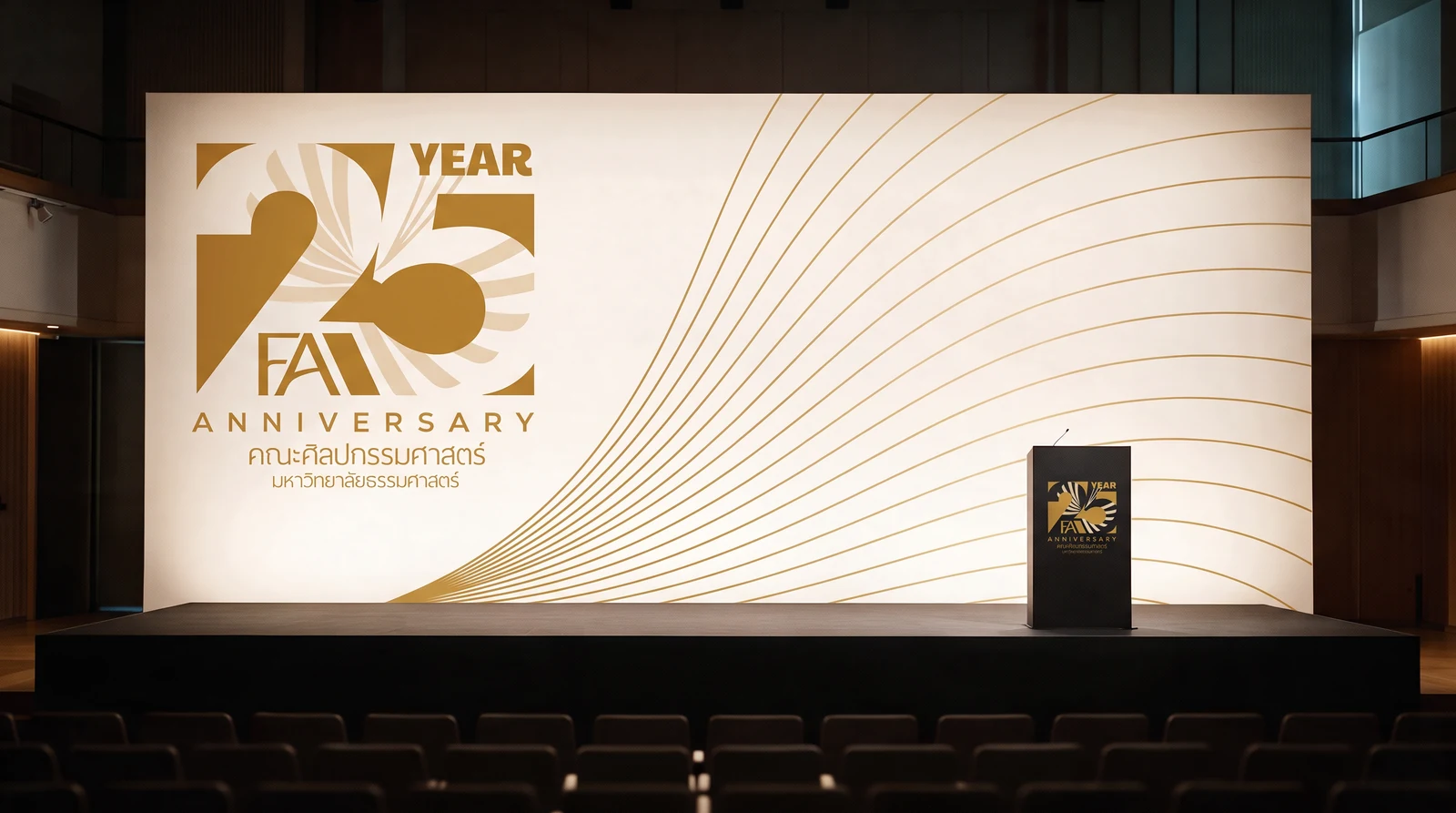
Ceremony backdrop and lectern — the fan field opened across the wall at its lowest density, the mark held clear of it on a solid ground.